 |
 |

|
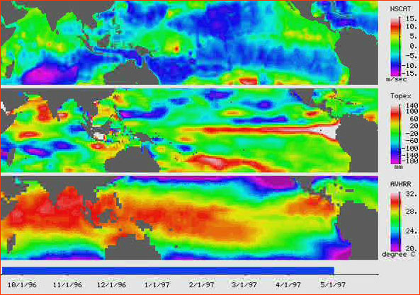
ENSO Surface Data Comparison back to article This panel maps the El Niño signal in animations of surface data from three satellite instruments: at the top is wind speed from NSCAT, in the middle is sea surface height from TOPEX/Poseidon, and on the bottom is temperature from AVHRR. The ability to see at a glance if a pattern of interaction exists between the three maps is just as important as the data itself. This still is from May 1, 1997. 
Image: JPL/NASA. Anatomy of El Niño | Chasing El Niño | El Niño's Reach Dispatches | Resources | Mail | Site Map | El Niño Home Editor's Picks | Previous Sites | Join Us/E-mail | TV/Web Schedule About NOVA | Teachers | Site Map | Shop | Jobs | Search | To print PBS Online | NOVA Online | WGBH © | Updated November 2000 |