GUEST: I got it from my sister, who worked in New York City, and she collected a lot of modern art. She liked modern art.
APPRAISER: Okay.
GUEST: And she would drag me, when we would go to different cities, to modern art galleries.
APPRAISER: Okay.
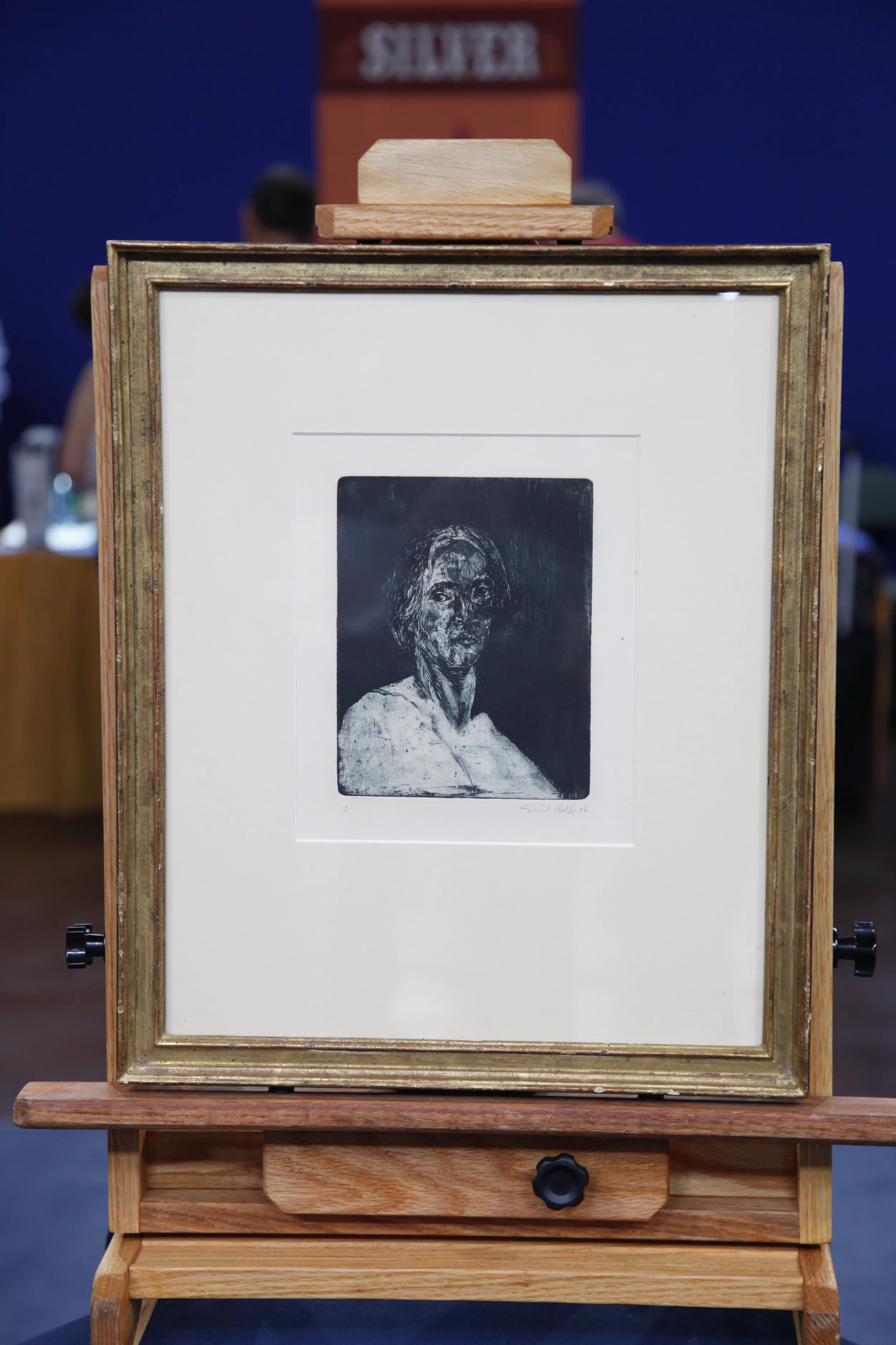
GUEST: Which I knew very little about. This is one of several that she has-- not by this artist-- but several paintings that she has and, and different lithographs. I tried to look him up on the Internet and couldn't read his name, the artist's name. It was the... ugliest one she had.
APRAISER: (laughs) There was-- you thought it was the ugliest one she had.
GUEST: I did.
APRAISER: But she probably didn't think that.
GUEST: No, she liked these a lot.
APPRAISER: Okay. It is a little bit difficult to read down here. The signature is in pencil and it's Roy Lichtenstein. So you have a lithograph and a screen print. It's a combined technique by one of the best-known Pop artists. Roy Lichtenstein rolls off the tongue when you speak of, of Pop art just as quickly as Andy Warhol. They're sort of in the same tier, okay?
GUEST: (laughs)
APRAISER: You can see here the edition number, 81 of 200, and it's dated 1975.
GUEST: Right.
APPRAISER: This is known as the "Bicentennial Print" by Roy Lichtenstein, and it was done to celebrate America's bicentennial in 1976. And you can get some of that imagery in the print. First of all, there's the... the red, white, and blue. There's a wheel here, which might suggest industry, the cornice of a building, sturdiness, various imagery here that leads to the strength and endurance of America. Now, Lichtenstein is probably best known, going back to the 1960s, for his use of cartoon images in prints. This is a mid-career work by Lichtenstein, when his, his style was becoming looser and more abstract. You have a very good condition in this print, for the most part. What we're mostly concerned about with contemporary prints in color is how the colors are holding up. The colors are really, really strong. In some of the yellows, which is more susceptible to fading...
GUEST: Oh, I see it.
APPRAISER: ...it does get a little bit lighter. You see that?
GUEST: I see it right around here.
APPRAISER: Exactly. We would like those to be more yellow. So the slight fading here is a bit of a problem, but doesn't terribly affect the value, because they're not really, really faded. On a scale of 10 being the best colors, this print is in about a seven and a half to eight.
GUEST: So it needs to stay out of the sun?
APPRAISER: It definitely needs to stay out of the sun. The signature is very strong, if somewhat illegible. (both laughing) And all in all, you've got what is a beautiful mid-career print by arguably one of the most famous contemporary artists of America.
GUEST: Amazing
APPRAISER: (laughs): Up until now, a mystery to you.
GUEST: yes, very much so. I'm so glad I brought it.
APPRAISER: So did you have any idea, just looking at it, thinking it was the ugliest thing you, you could... you could imagine, what something like this might be worth?
GUEST: I don't know, probably a couple of thousand dollars if... I probably would have sold it, when I was selling things, for $1,000, easily.
APPRAISER: Okay. I, I would say a replacement value on this-- taking into mind the slight fading of the colors--would be in the neighborhood of about $15,000 to $20,000.
GUEST: (laughing) Amazing.
APPRAISER: So... (laughs) Good for you.
GUEST: I actually probably would have sold it cheaper than that.
APPRAISER: Well...
GUEST: Isn't that amazing?
APPRAISER: I'm, I'm happy you brought it in. I'm happy I could give you more information about it.
GUEST: Thank you, I'm so glad you were able to tell me about it. That's wonderful.
APPRAISER: Thanks again.
GUEST: She would be pleased. So now I like it better.
APPRAISER: Exactly. (laughs) When you see the-- it's better, right?
GUEST: Definitely, I like it. So maybe I'll, maybe I'll keep this now.

