Flesh and Blood: Filming Locations & Look
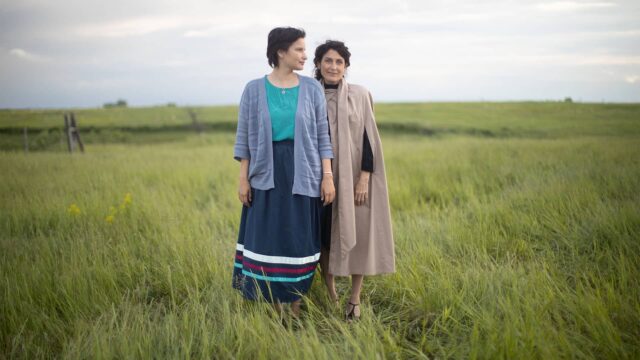
Goodbye, gritty…hello, gorgeous! Against a beachside backdrop, Flesh and Blood infuses its delicious thriller with family drama and sun-soaked suspense. But where were these spectacular scenes filmed, and how did the series achieve its nostalgic, sun-kissed look? Find out in our interview with Flesh and Blood‘s production designer, Tim Dickel.
At the heart of Flesh and Blood are two homes. Vivian’s is a place that she wants to move on from, whereas for her children, selling their family home feels like a huge loss. How did you convey that, in creating this physical world?
It needed to feel really special and warm for the family, so I approached it that way round. For the rest of the family, it had to be a place that they always wanted to return to it, like receiving a nice, lovely hug, a metaphorical hug. My idea was that most of the colors in the house would reflect what you saw on the beach, and the beach and the home became one thing, really. But I was never trying to say too much about Vivien leaving—I was saying more about what the family would miss. So the house was more about the kids, really.


It feels like an accumulation of their whole childhoods into their young adulthoods.
Right, and that’s the important thing about a set. I think it’s really funny when people say, “We’re going to set this in the 1970s,” because that actually means you’re setting in the 1950s, ’60s, and ’70s. A set should always be the history of people’s lives—to me, it always should be a textured, layered life story. And that story is what you’re trying to tell, I think, when you’re putting a set together.
How did you go about making Mary’s house feel true to her character?
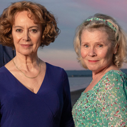
I think that talking to Imelda [Staunton] really helped. It’s a privilege, really, to actually spend a bit of time with the actor and go, “What do you think?”, because I want them to walk in and feel like it’s really natural for them to be there, which is a design thing. But also, it’s trying to meet the acting and the design right in the middle so you get the best effect. Even Imelda talking about what plants would be in her garden, and how we would have a greenhouse, so that when she flowed through the space (even though some of that was a building in London and some of it was on the beach), she would feel like it was her home. And to me, she really had such a lovely impact on it. When we were doing all the sewing stuff, she was like, “I want to learn how to sew properly.” So beforehand, I sent someone in to teach her how to do this, one of my buyers, who actually was also a quilt maker on the side. When you’re working with someone like Imelda, she really soaks up the role, so I think you have to take that on board and be a little bit humble about it—you want to design it, but you want to design it almost with her, rather than you just designing a set and it being about your ego. It’s not about your ego, it’s about getting it right for the actress or actor.


Did you create the greenhouse for the production, or was it originally there?
No, the whole area was just decking, and their kitchen basically was a sun lounger room. It was a challenge because the tricky thing for us was finding two houses next to each other on a beach, in the UK, with a beautiful view. It’s just not that easy. Big Little Lies, they’ve got 100 to choose from, but for us, there’s not that many where you get that complete contrast of houses. So we had to really take those two houses and basically push one out and strip one back. For Vivian’s, the whole house is cluttered, it’s repainted, whereas Mary’s, we just dirtied that right down, we changed it. It had a glass balcony on it, originally, so we covered the glass balcony with sort of a ’60s heathered, horrible, balcony area. It was about trying to see what we could do with both those spaces, really.


What was your biggest challenge?
You don’t quite realize it when you’re that close to the water, but when the elements kick in, they kick in properly. So we were shooting in London while still trying to do [pre-production] on the coast, and we had painted the house the day before. We had a fantastic art director, Guto Humphreys, who had the joy of going down the following day to find that there was no paint left on the house because they’d had such bad rain! There was nothing we could do about it, we’ve just got to crack on, basically, and see what we can do next. So being aware of the elements was a very good learning experience, and if I did it again, I would factor that in massively, because we had the worst thunderstorms we’d had in that area for around 20 years. It was quite apocalyptic weather when we were trying to paint.
Another challenge was to tread incredibly carefully and sensitively when you’re going into the houses of people who aren’t really used to filming, because they don’t know. The guy who owned Vivien’s house had rescue tortoises, so it became quite a big thing that they would be safe in this area of the house. So being sensitive to everybody’s needs when you go into their home as well, I think, is really important.
It’s surprising to hear about the weather, because in the show, it looks like perfect beach weather!
It was very strange—during the pre-production, when we were painting, decorating, cladding, the weather was pretty good and then just went terrible. But most of the time we were shooting, it was absolutely glorious. And that’s exactly what we wanted as a look, because we were trying to do this murder story, but mine and [director Louise Hooper]’s take on it was always that it felt light in its color palette. I just brought a couple of shells into her office and went, “These are the colors I think we should use, the ones that are on the beach,” to make it a murder mystery that’s not dark and gritty, and lift it to being a different kind of show, which is quite unusual in the UK. And actually, she completely went for it. And I loved working with her. I remember showing her a picture, saying, “See this?” She said, “What do you mean about all this color?” And I said, “Imagine a 1970s bright orange car that had been drenched by the sun, and faded, so the color had almost dropped out of it.” And then she went, “Oh, I totally know what you mean.” And so we made all the colors a little bit like that, so they felt lived in. They’re not just like, “Oh, that’s bright orange, that’s bright green”—there’s a history to the colors, as well.
![]()
![]()
Can you talk about your idea of costume as a part of set design?
I think it’s really important that you don’t work in isolation. The beauty of film or television is that you all work coherently as a team. And I think sometimes, we build a set and then we think about what someone’s going to wear in it later. But it’s so much more interesting to sit down with the costume designer and go, “This is the color of the set. Do we want that person to disappear into that set or do want them to stand out? And is the wallpaper going to be busy? Is it not going to be busy?” We were quite keen on using block colors so that their frames sat in the set, but then also, we would almost make them go invisible when we wanted them to seep in and just disappear into the background. So that’s why I just think it’s really, really important. I think it really works on the show, and I’m really glad that we all got together and went, “Is this going to work for the show?”


Flesh and Blood‘s filming locations are primarily along the Kent and Sussex coasts. What can you tell us about the dramatic cliffs, the great long stretch of beach with all the little pebbles, and the dunes?
Weirdly, they’re all on the same coastal line, but I would say they’re probably all just 50 kilometers from each other. It’s one of the greatest coastlines in the UK. Actually, I would say UK coastline is very, very good for filming. I live in Wales, and that coastline is amazing, absolutely beautiful—I think it just doesn’t get used enough. But what we did was, we generally spent days on Google Earth just zipping along, zipping along, zipping along. And we did the same thing reccing [doing pre-shoot reconnaissance] for the houses as well; we were like where can we go? And then we went okay, we’ve had a little quick look on Google Earth, now let’s just go walk. Some days we’d just walk, and walk, and walk along the beaches, just to find what we thought might be the right houses.
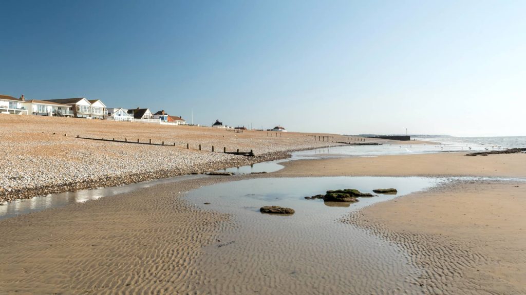
I knew the coastline from my youth a little bit because I lived not too far from it. I hadn’t ever been to Beachy Head, the site with the cliff. It was stunning, that was. And then the beach they live on, Norman’s Bay, is more rustic, and a bit more edgy. It’s weird, because on screen it looks so pretty because of the weather, but it is got a slightly eeriness to it as well, actually, when you go there. It’s definitely quite a remote area—you wouldn’t really go there unless you knew about it, and there are a few little pockets like that along there. They’re odd little beaches, basically.
The place where the dunes are, Camber Sands, is absolutely beautiful—I’ve been there on holiday a couple of times. It’s quite amazing. It doesn’t look like it, but at the end of it is a massive nuclear power station, and then there’s [British film director] Derek Jarman’s house. You’ve got this really weird environment with this amazing house that one of the greatest directors lived in, and then you’ve got this horrible, weird nuclear power station, and then you’ve got this amazing beach with sand dunes. It’s a really strange area—we picked out some really odd areas, but somehow Oli Russel, the lovely DP [director of photography], made them look stunning on screen.
1 of 4
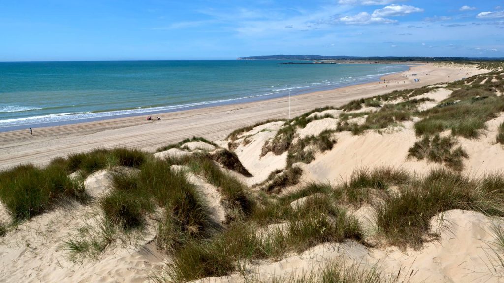

Camber Sands is known for its expansive, unspoiled dune system, and its wide (and uncharacteristic on the Sussex coast) sandy beach.
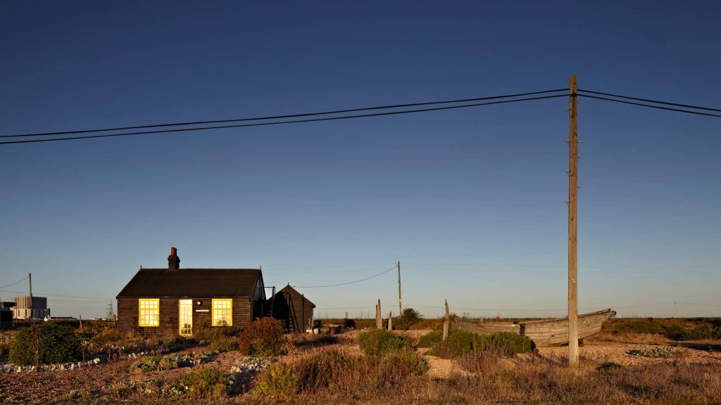

Prospect Cottage, the former home to late British film director Derek Jarman. In the far-left background, the Dungeness Nuclear Power Station is visible.
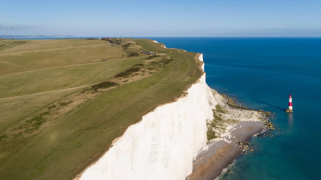

The highest chalk cliff on Britain's southern coast, Beachy Head rises 531' above the sea.


Normans Bay is a shingle (rock and pebble) beach, with a wide stretch of shallow sand flats exposed at low tide.


Camber Sands is known for its expansive, unspoiled dune system, and its wide (and uncharacteristic on the Sussex coast) sandy beach.


Prospect Cottage, the former home to late British film director Derek Jarman. In the far-left background, the Dungeness Nuclear Power Station is visible.


The highest chalk cliff on Britain's southern coast, Beachy Head rises 531' above the sea.
