Behind the Scenes of the Opening Titles Sequence
From capturing the Yorkshire Dales to taking us on James’ journey, the designers of the All Creatures Great and Small titles sequence, Ben Marshall and Ed Dalton, reveal what they were going for, how they made it, and what hidden gems we can look for. Plus, they answer our burning question about its similarity to certain other MASTERPIECE series we all love…
Did you have any experience with All Creatures Great and Small before beginning your work on the titles and branding, and what was your process once you’d taken the job?
Ben: James Herriot was one of my favorite authors when I was growing up as a child, so I was intimately familiar with all the characters, all the settings, all the books—I’d read every single one of them. So when the request to work on this came through, it was like a dream come true. It was like, “We cannot say no to this job, this is going to be amazing.”
Ed: Of course, we said yes, we’d love to work with them on the project, so we took a train up to the set, which was amazing, and obviously the Yorkshire Dales were absolutely stunning. It’s such an incredible part of the country, and being able to be on the set, see the environment, and hear more about the show, with the privilege to see a first edit of the first couple of episodes, we got a sense of what the show was about. Then we came back to the studio and spent a good period of time coming up with, I think, around 20 different conceptual ideas for what the idea could be.
The first concept we started developing was actually live-action based—not illustration-based—and was going to be much more macro details of the environment: the house, the landscape, and really just embodying the nuances or the qualities of the show and the environment. But then as we started to evolve and develop out the concept, we felt it was missing something of that quality that [the production] described as a warm bath—that kind of cocoa, warm, charming feeling.
So we went back to one of the other concepts we’d looked at, a more illustrative route, thinking, “How can we start to create an embodiment of the show?” through that. And that route was all around travel posters. We were trying to think of something we thought was timeless, and still kind of modern—we could reinterpret it, but something that felt quintessentially of that period and of that time.
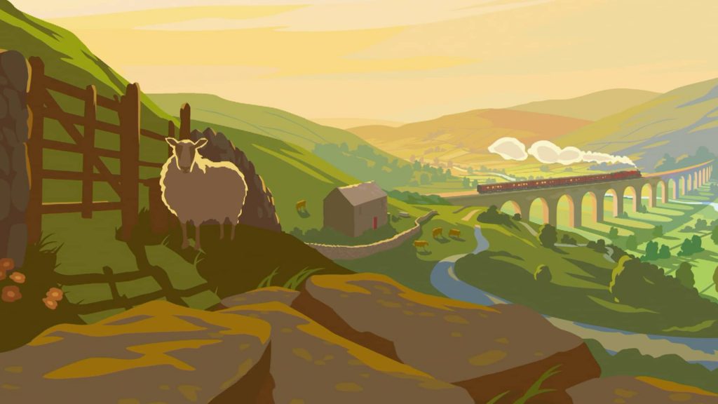
Ben: It was almost like the “Visit Yorkshire” travel posters, the ones that you used to see at train stations, because the beginning of the show is James Herriot getting on a train and arriving in Yorkshire. So it felt that it really beautifully tied into that evocative nature of wanting to be there—actually seeing the title sequence and going, “Yeah, I want to go to Yorkshire now,” was our aim.
Ed: It’s that sense, within the show, that with the title sequence we are welcoming the viewer in. We wanted to create that sense that they are coming into the world of All Creatures. As Ben mentioned, with those classic posters of the old steam trains traveling across viaducts and across the stunning landscapes, there’s a great arresting quality to those, just perfect to capture within the title sequence. So we really started focusing on that visual look. And then we thought, “Well, how do we create a sense of bringing the viewer in? How do we welcome them into Skeldale house?” And we thought back to the first episode, and James arriving at Skeldale house and arriving on the steam train, and then the bus journey and then the car journey, and arriving at the house. So we thought, “Why don’t we represent that journey of moving through the landscape?” That was the essence of the idea.
Ben: What’s really lovely is what Skeldale house represents in the show. Every day after they’ve been out on the Dales—it’s been cold, it’s been hard, they’ve had lots of trials and tribulations—but they always come back home to this nice, warm place, with a fire and a brandy. And we really wanted to try and capture that feeling of location as the focus of the show. It’s almost like the hero.
Once you found your concept, were the qualities you were looking for in an illustrator, and how did you go about selecting Gary Reford?
Ben: We had a short list of over 100 illustrators to start with. That was actually one of the most time-consuming parts of the process, because it was a very specific kind of style that we were after, and even within a specific style, there are so many different sort of flexes that you can have on that. So finding the perfect person was actually a really big thing. There were hundreds, and then there were 14, and then we got it down to about 10, which we shared with the client, and then managed to whittle it down to Gary. But it was actually quite an exciting process, just talking to lots of people, getting a feel for what all of these different kind of possibilities could be.
Ed: The other thing we were looking for with the illustrators was someone we felt could capture the essence of the travel posters of the era, but we didn’t want a copy of it. We wanted something that still felt like it was a moment of this moment, of this time, which this show is. It had to have that fine balance. We felt there was something about Gary’s work that perfectly balanced that warm sense of nostalgia, but also felt really modern, really fresh. The way he utilizes colors and forms, it feels really fresh and vibrant. For example, if you look at posters of that era, the color palettes are slightly more muted, and there’s less of an array of colors than we use, and even the way they blend those colors. Whereas the way Gary uses it, there’s a broader range of colors that are also slightly more popping in their hue, so there’s more vibrancy that comes through. I think the forms are also slightly sharper in comparison to posters of that time. So though it looks very familiar, there’s also a quality that’s ownable for the show.
For Season 1, I spoke with the show’s production designer, Jacqueline Smith, and she told me that she liked to include a pop of red throughout the landscapes. Did you see this pop of red as you were taking everything in?
Ed: Yeah, absolutely. That was one of the things that was mentioned to us, so if you actually watch through the title sequence, there’s a pop of red in every scene. It’s really subtle in places, but it’s there. And one of the other things with the title sequence is—knowing that the hope for everyone involved in the show is that it’s going to be around for a long time—is repeat viewing. We didn’t want something that looks great on the first view, and then after, you kind of lose that attention. We wanted to have lots of detail, lots of moments you may not necessarily see, like those pops of red, or the fact that there is the steam train in the first shot, but then in every other shot the car is there, even the second to last scene, which you can hardly notice, but it is there. It’s those kind of details that you may miss on first viewing, but when you watch again and again, you start to notice these things, and your relationship with the title sequence starts to change as you start kind of learning more about the show.
Ben: Something we really enjoyed about the process was that this was Gary’s first experience having somebody take apart his stuff and make it animated. I think he was initially a bit scared, but then he got very, very into it, to the point where he was giving us lots of creative direction in terms of, “maybe you should make this a bit brighter,” and “maybe you should introduce this,” and it was a properly collaborative effort. It wasn’t a case where Gary created the artwork and then gave it to us—it was very much a two-way process. We would ask him his opinion on things, because obviously, he is the illustrator, he’s the artist, so he knows how to compose a scene, and then we’re obviously, from a technical point of view, trying to make that come to life.
On the back of that, just from a purely technical point of view, the sequence itself is actually 3D, not 2D. A lot of the time when you do stuff like this, you basically just cut the layers up and move them around a bit to create the illusion of 3D. But we wanted to make it feel realistic, so we did chopped it all up, but then created the landscape in three dimensions, and used a technique called “projection mapping” to actually project the illustrations onto the 3D landscape, and then we moved a virtual camera through the landscape. It’s very, very subtle, but it means that you get the proper parallax. Like the rocks in the foreground scene, they actually have geometry and you can see them moving ever so slightly differently. We wanted to make it as immersive as possible, so when you see it, even though it’s illustrated, it feels like it could be a world that you could actually visit and actually go into.
What are titles sequences in general supposed to accomplish? What is the work they’re there to do?
Ben: Obviously it depends on what show it is, but particularly for All Creatures Great and Small, and I do think for a lot, it’s to provide that perfect beginning to the audience’s experience. By the time they get to the first frame of the first scene, you want them to be comfortable with what’s about to happen. It’s almost like setting the scene, in a way, like, this is what you’re going to experience, and here it starts.
And look, I know title sequences happen after the first scene has already happened, but for us, for this one particularly, it was very much just a scene setting and getting people in the mood, so they know what’s about to happen. It really has to reflect the tone of the show. And I believe as well, when we’ve laid out some of the frames from the title sequence with some of the frames from the actual show, it’s amazing how well they go together, just in terms of the color pallets and the tones. So I think we didn’t do a bad job there. Gary, with the illustration, didn’t do a bad job.
Ed: We always say that it’s the job of the show to tell the story, not the title sequence—the title sequence is about setting the tone. It’s almost like frequencies in music, you want to get people in the right kind of tone, the right mood for the show that’s going to come, so they get a sense of what they’re being brought into. And for us, you’re almost capturing the essence of what a show is about, rather than trying to tell a particular narrative. This title sequence does have its narrative in itself, but it’s effectively there to help us encapsulate the essence of what the show is about. An interesting thing about it—and we haven’t discussed this with the production, and I’m not sure how much of this was intended—but if you watch the first episode of the second series, it subtly references the title sequence at the beginning of the show, through the live action.
Ben: Yeah, we were very chuffed when we saw that, either subconsciously or deliberately, they’d done that, because it was very much a validation of the creative flow that we decided on. That was pretty awesome.
Ed: We see him arriving on the steam train, and then he’s picked up in a car and we see the car driving across the bridge with the stream underneath. And then they do a stop at one of the farmhouses along the way, and then it ends with them at Skeldale house. So it effectively replicates that journey that we see in the title sequence.
Ben: In a way, it was a full circle, because the title sequence itself was designed to hit those points: the steam train is obviously from the show at the beginning, and then the bridge that he drives over is actually the bridge in the show—we took that from the location footage—and the farm that we pass in the third shot is actually Helen’s farm, so it’s actually directly modeled, it’s supposed to be that. And then as we go into Darrowby, that is literally the view down. So it’s very much an actual narrative based on real locations, even though, obviously, artistic license has been taken.

Something that many of our viewers have asked about is the title sequence to a show we aired for four seasons, The Durrells in Corfu. It had an utterly delightful animated titles sequence, and viewers have wondered if the All Creatures Great and Small titles shares any DNA with the Durrells titles? Both are animations for very charming, often comical, period dramas with animals, after all…
Ben: We’re big fans of that sequence now, but we weren’t aware of it when we began this process. We found out about it while we were already in production, and it was actually a slight flag, and we did have to have the conversation, “Are our audiences going to think that this is too similar?” But we came to the conclusion that actually, it’s a really good thing, because in a way if it was the right approach for The Durrells, then it was the right approach for All Creatures, and a kind of a convergent evolution of creativity, in that sense. Obviously, after seeing The Durrells, we love it. I think it’s amazing. But it certainly wasn’t the case that we saw that and then went, “let’s do something similar.”
Ed: If I remember correctly, we had already moved on with illustrating everything out, and getting to latter stages, when Ben had a conversation with his dad about the approach. And then on the weekend, your dad was like, “Oh, it sounds really quite similar to The Durrells title sequence.” And then I had a chat with Ben on Monday morning, and he was like, “Ed, have you seen The Durrells title sequence?” So when we saw it initially, we did have a slight, “Oh my God, is this going to be an issue?”, as Ben mentioned. But I think that the reality is, they’re both two uniquely different shows, but at the same time they’re both set in the 1930s, ’40s. Although The Durrells is set on Corfu, there’s something quite quintessentially British of that time within the shows. They’re both set in beautiful landscapes, and of course they have amazing characters and wonderful animals at the heart of those stories. So there’s lots of almost similarities there. It’s almost a process of convergence. Great ingredients to work with, let’s do something illustrative, and I guess that process means you end up with something that has that similar vibe.
Ben: We took it as being a positive thing in the end. And the client did, as well, which was great.
I think our viewers, many of whom are fans of both shows, will be tickled by your story, and happy to learn more about the process behind these wonderful titles that welcome us into the world of a show they love so much. It sounds like creating them was almost as wonderful as watching them!
Ben: I think the loveliest part is that it’s such a perfect antithesis to the trying times of the last couple of years. After all the hard times that’s happened, it’s escapism at its finest, and it’s come along at just about the right time to just lose yourself in. It’s been such a privilege to be able to work on it. Honestly, from a creative point of view it’s been the best thing I think we’ve done in the last few years, 100%.
Ed: We’ve done lots of title sequencing in the past, and we work with big, huge, sporting events at stadiums around the world and huge audiences, but I’ve personally never worked on a show where all of my neighbors around here, and every generation, watched the show and loved it, and loved the title sequence and wanted to know more about it. Sometimes things are very unique for a specific audience, but this seemed to break boundaries, break barriers—everyone, no matter who you are, just seemed to love it. It’s the idea of a family show, and there’s something really lovely about that.